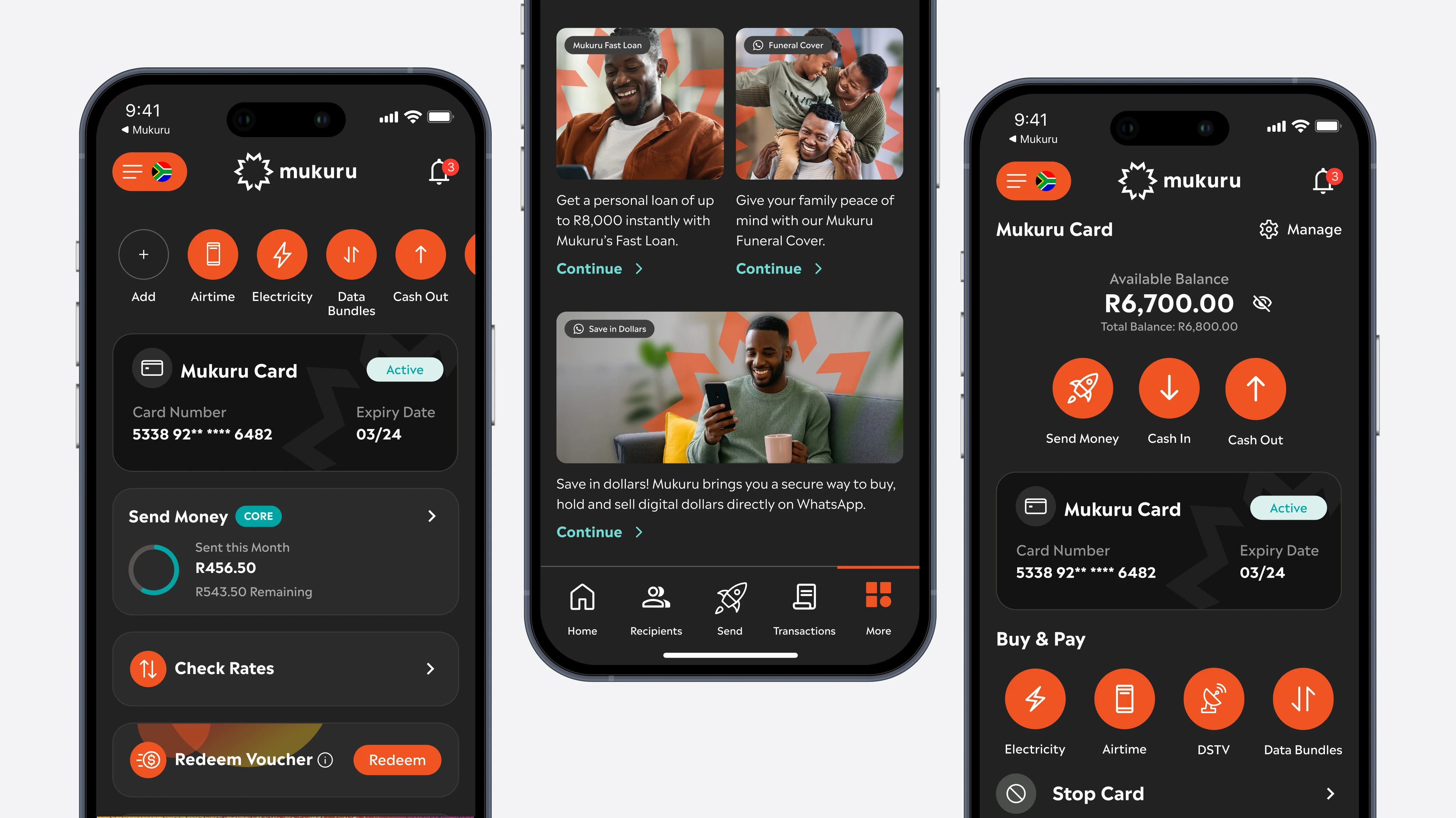
Making room for more.
Mukuru’s app had to make room for a card, a wallet, loans, insurance and savings, without losing the customers who only wanted to send money home.
Over three years, without a gap.
Mukuru’s roadmap was growing faster than they could build their own product design team. We partnered with their internal teams, worked in their sprint and review cycles, and delivered for more than 750 working days without a break, until we were contributing across their whole ecosystem.
Designed for how money really moves.
Many of Mukuru’s customers are migrant workers supporting families in other countries, often without easy access to a bank, and on small, budget phones. Cash is still how much of their money arrives, and for many of them the journey doesn’t begin or end in the app. So we designed for every touchpoint: the app, the web, USSD, WhatsApp, branches, booths and agents.
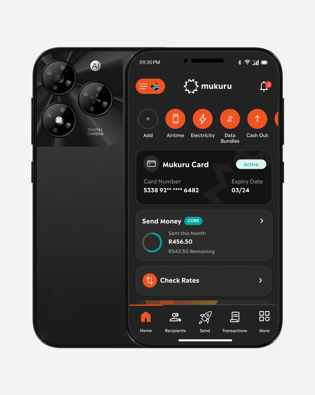
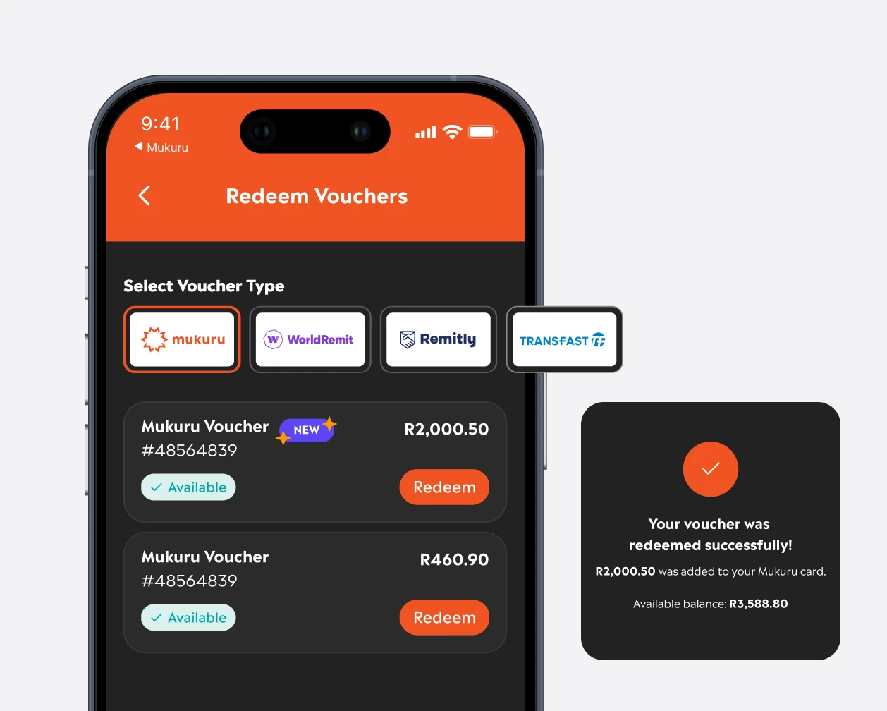

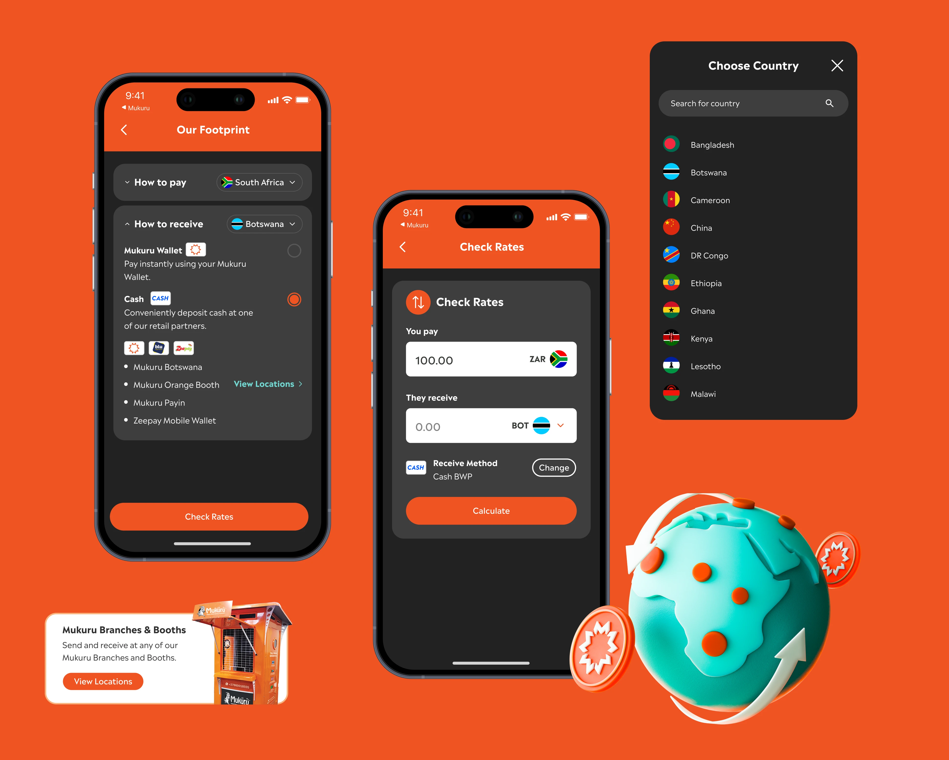
Across borders, and off the screen.
Rates that change from country to country, cash pick-ups, and remote branches and booths are all part of the customer journey. The experience had to stay as painless as possible, on the screen and off it.
A voice in the bigger decisions.
We worked directly with Mukuru’s leadership as they decided where the app was heading next, and our designs and questions shaped what they agreed: one home for every customer, adapting to the products each person holds and to what each country’s law allows. That set the course for Mukuru’s move from a card to a full account.
Clear on every cent.
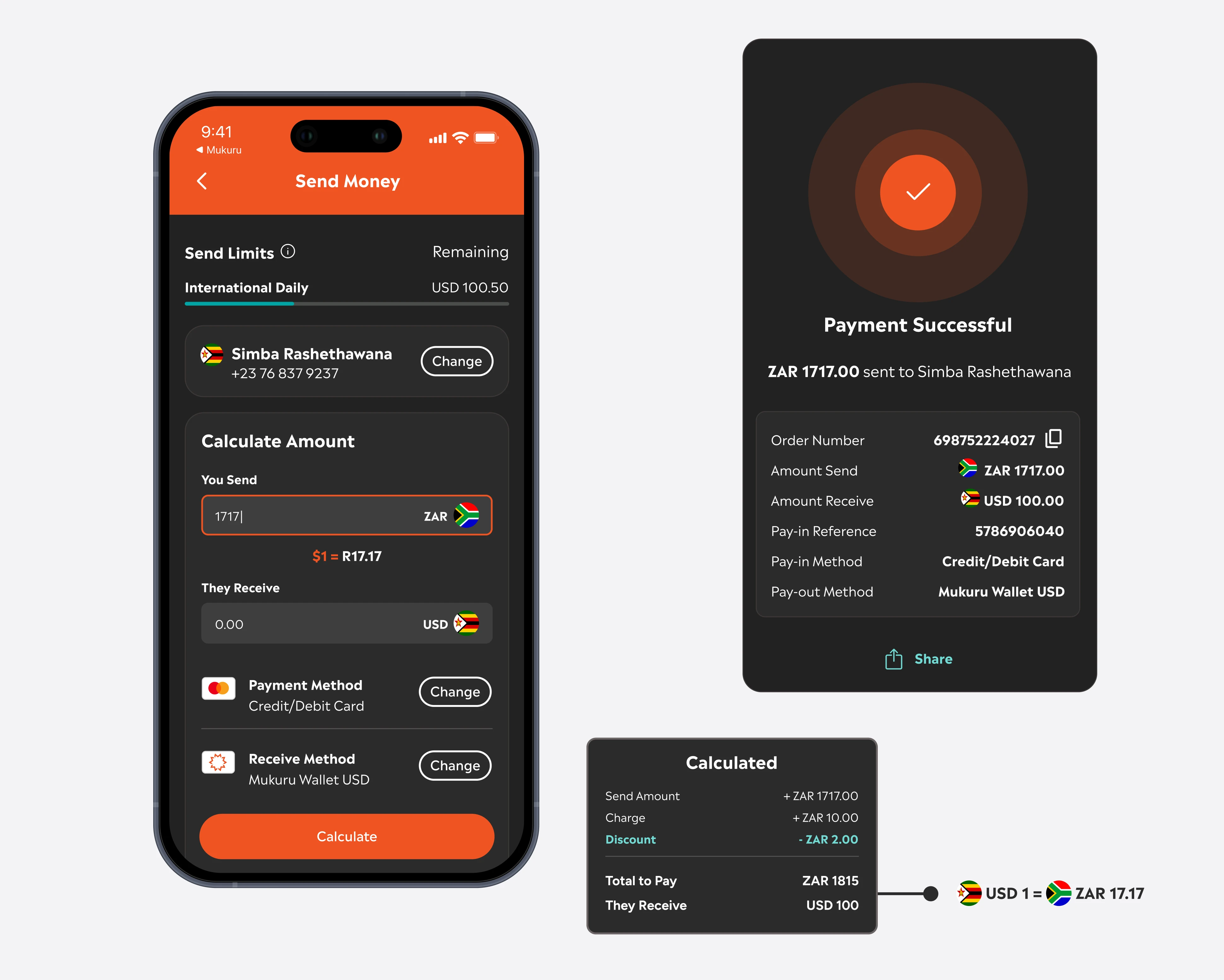
Before anyone paid, they saw the exchange rate, any discount, the fee and what the recipient would receive in their own currency. Afterwards, a confirmation they could share.
What we designed for Mukuru.
Over three years, our work impacted almost every customer, at almost every touchpoint, across Mukuru.
Send Money
Sending money to other countries from South Africa and the UK with peace of mind at every step, from managing recipients to the final confirmation.
The transactional website
Translating the app experience to the web, so moving between the two felt familiar and seamless.
The Mukuru Card and wallet
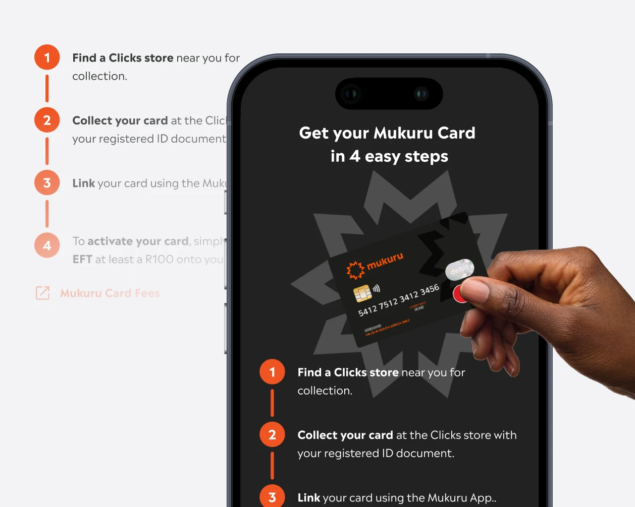
From sign-up and activation to cash in and cash out, through several channels.
Onboarding and verification
Registration and identity checks built to meet stringent legal requirements, with profile management and send limits handled with the same rigour and sensitivity.
Value-added services
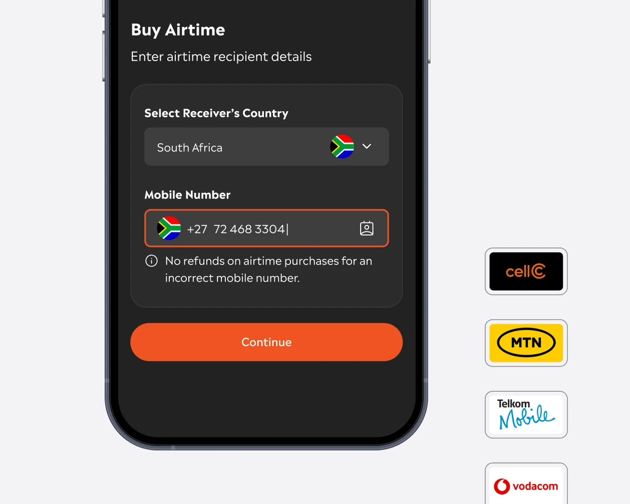
Buying airtime, data, electricity and vouchers, and applying for short-term loans, all in the same app.
USSD and WhatsApp
Access to Mukuru in Botswana and Malawi for customers who don’t use the app.
Enterprise payments
A B2B portal that brought several payment and collection options together, for organisations operating across Africa.
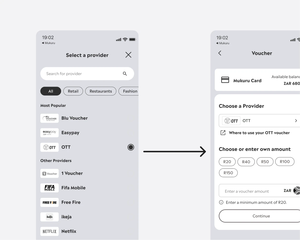
Designing beyond the interface.
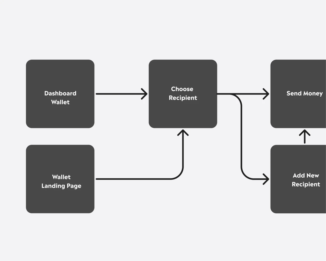
Flows and journey maps helped Mukuru’s teams see the whole path, not just the screen. When our assumptions needed evaluation, we spoke to the people who spoke to customers every day: Mukuru’s country teams and call-centre staff.
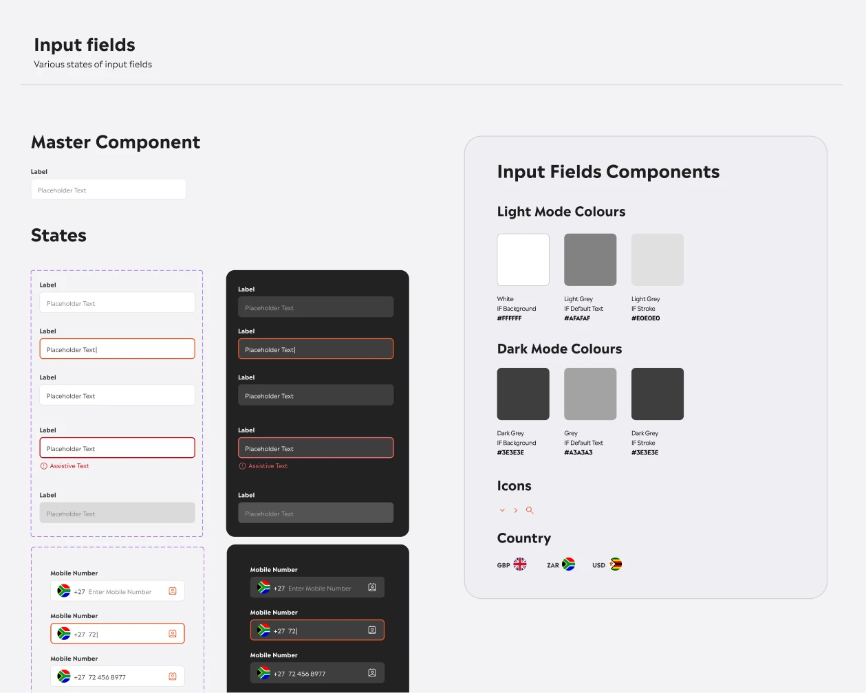
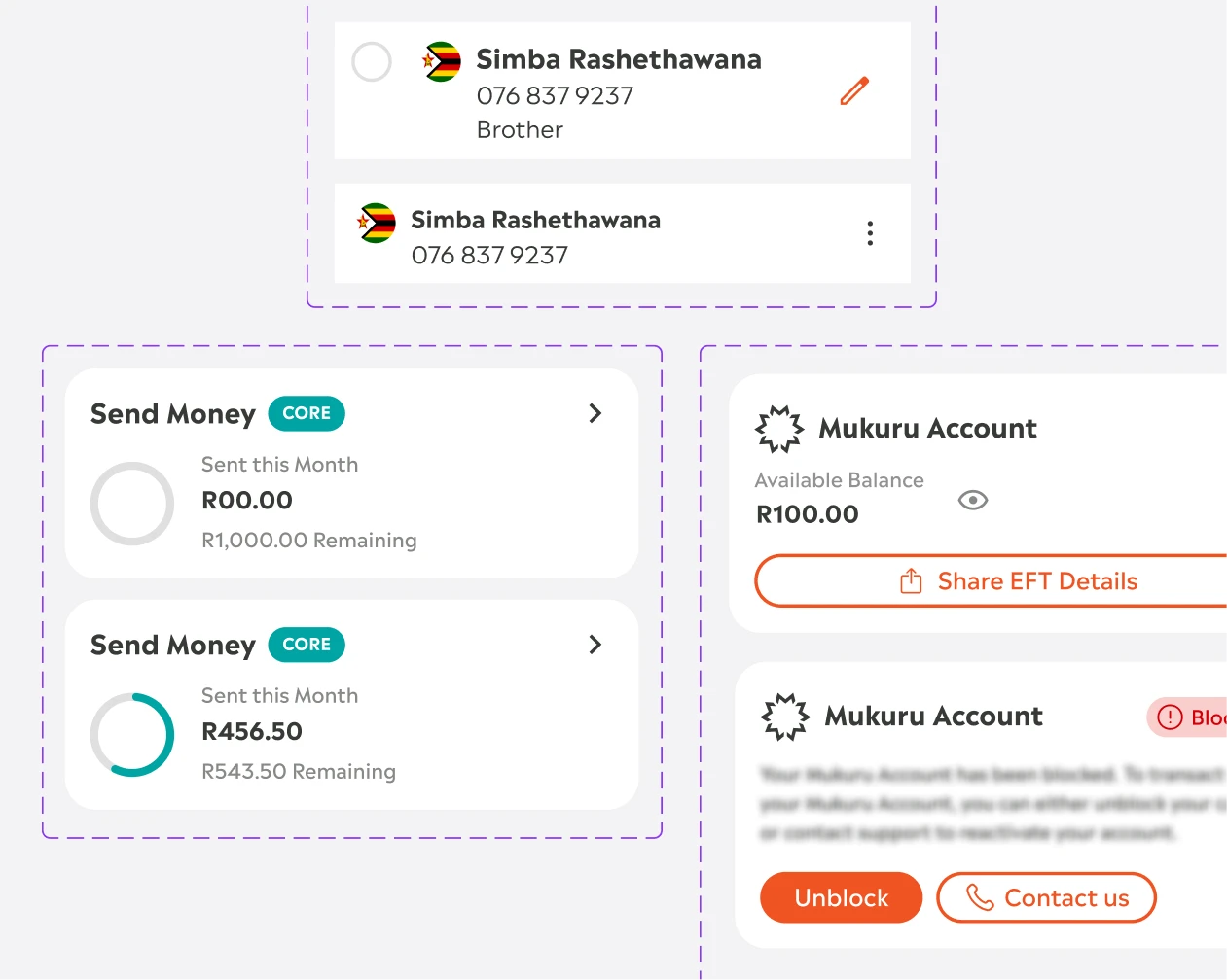
One system, many experiences.
A shared vocabulary and visual language kept the app, the website and the portal consistent, so each new addition built on what customers already knew.
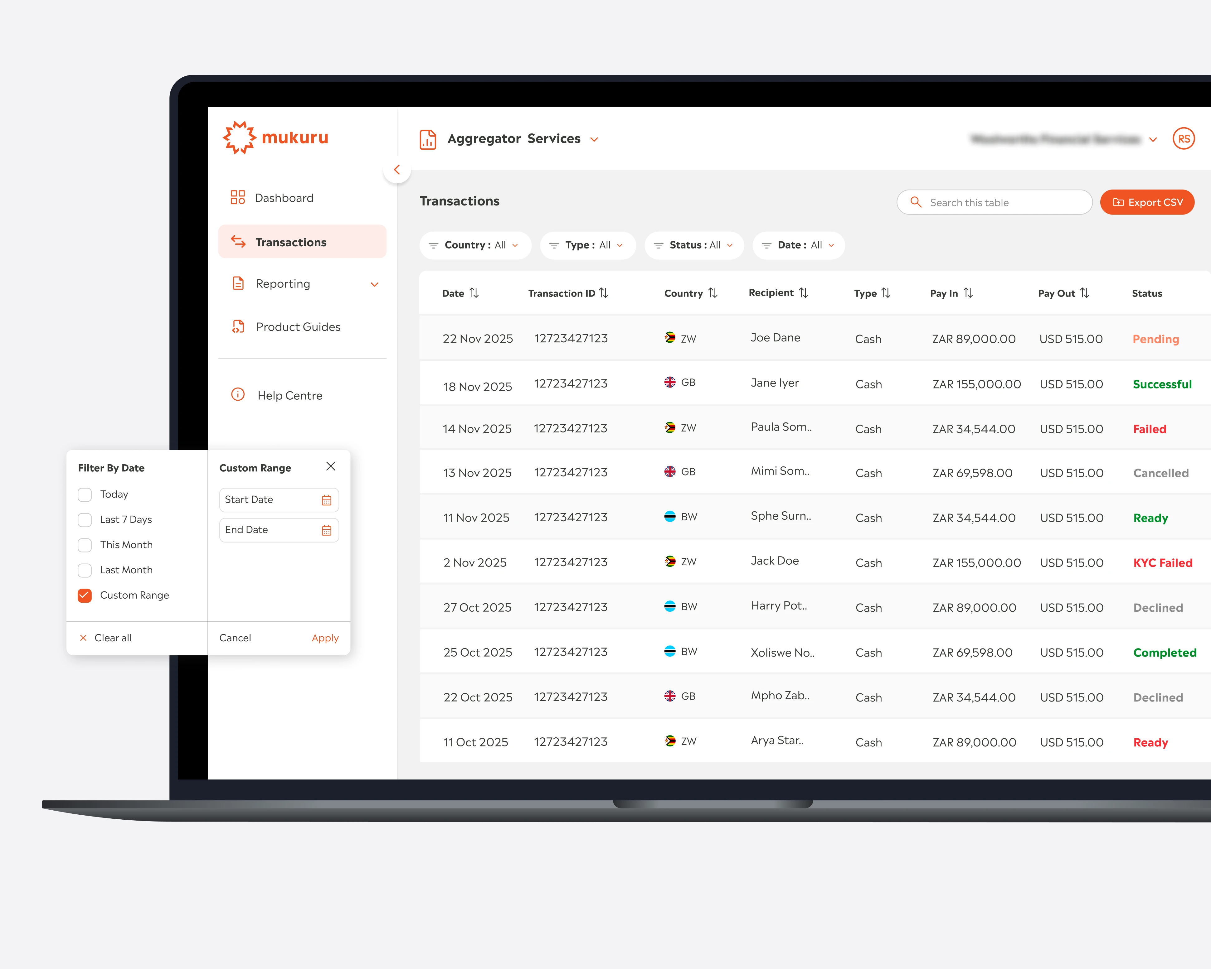
A portal for business services.
Mukuru’s B2B portal united several enterprise payment and collection services under a single admin layer and visual identity. Shared patterns, terms and interactions reduced cognitive load and made each service quicker to learn.
What changed for Mukuru.
A transactional website
Mukuru’s transactional website launched in 2023, bringing the app experience to the web.
The card in the app
Much of 2024 went into bringing the Mukuru Card into the app, so customers could request and activate a card and use it with confidence.
Research and testing
A long-term testing strategy, and qualitative usability testing with Mukuru’s call-centre staff.
A system to build on
A design system, an icon library and implementation guidelines in Mukuru’s own workspace, with design QA to keep each build true to the designs.
Ready for the next team.
Mukuru always planned to build their own product design team. So we built the capability alongside their people, and kept the system, the practices and the files in Mukuru’s hands. When Mukuru was ready to move product design in-house in 2026, their new designers picked up a working system, not a blank page.
 Sandy RheederChief Information Officer, Mukuru
The standout of our engagement with Hey Guys has been the way their team engaged and delivered alongside ours.
They have built a talented organisation, and it has been a pleasure to work with them. I would definitely reach out to Hey Guys again when we need dedicated UX design support in the future.